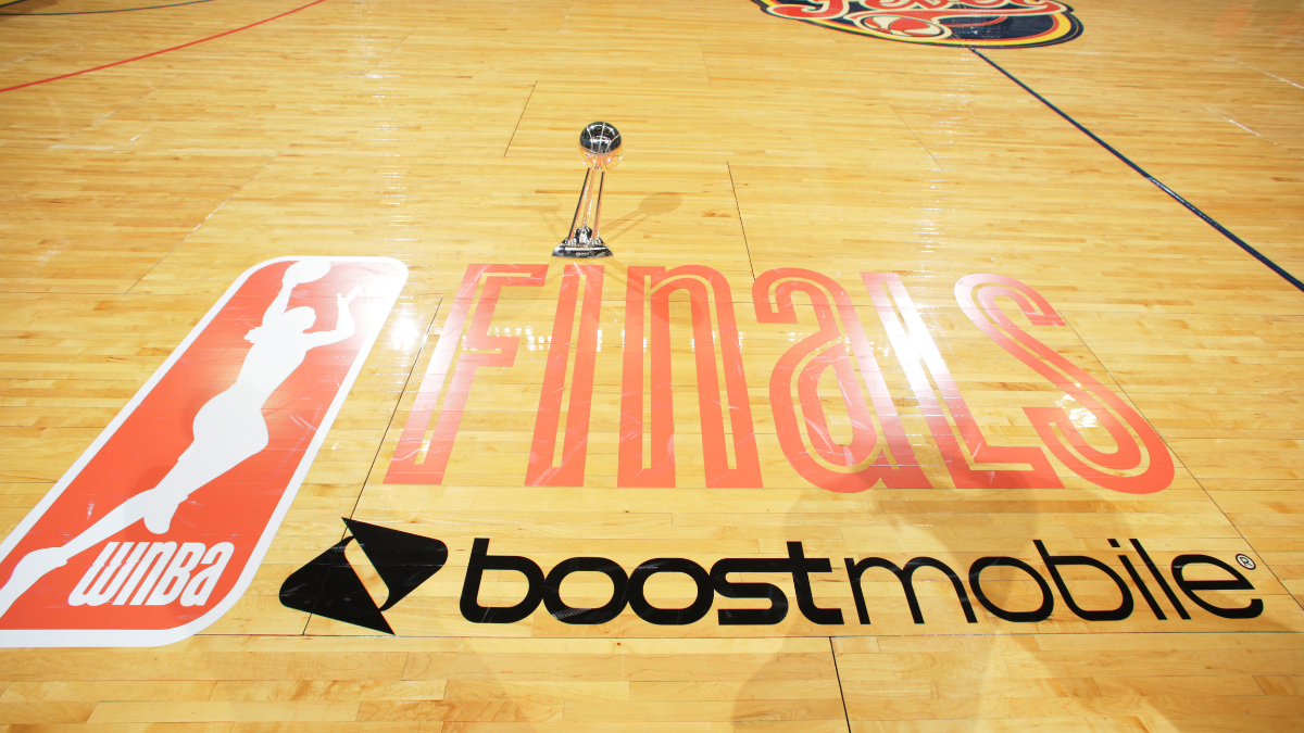

The WNBA made yet another splash last week when they unveiled a brand new logo for the Finals, ending an eight-year run for the rather generic white text logo we’ve had since 2018. As the league approaches its 30th Finals, the new logo feels like a callback to some of the classic championship logos we’ve seen across sports in the 90s and 2000s.
The new WNBA Finals logo is the sixth version in league history and is easily the most detailed we’ve seen thus far, featuring the championship trophy and a font that’s more crafty than generic. While it has touches of retro logos we’ve seen in the past, it still looks like a modern logo that makes sense in the year 2026.
Of the six versions, you could make a serious case that the new logo is the best of them all. And since we have a month without live WNBA action during the FIBA World Cup break, we might as well take this time to rank all of them and see where they all stand.
6. 2018-2025
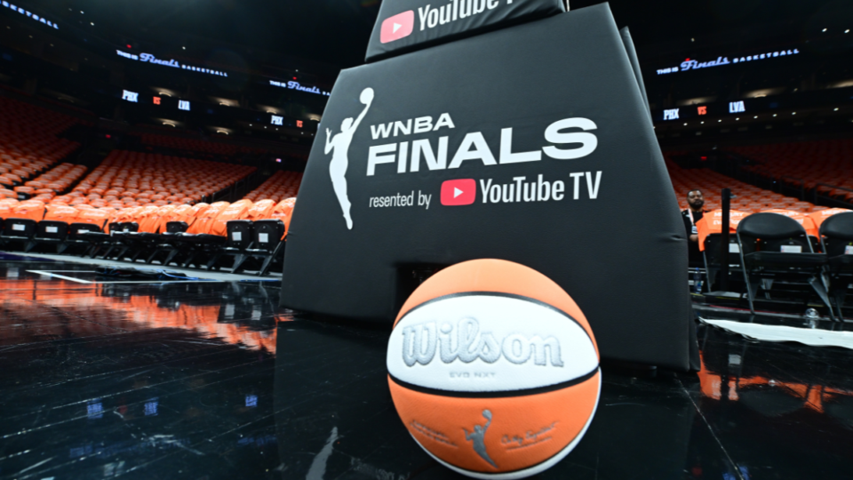
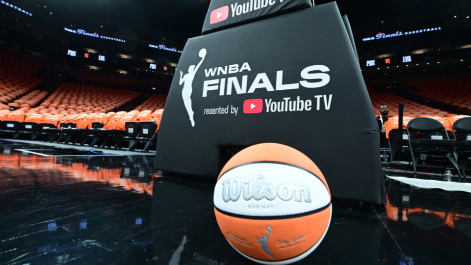
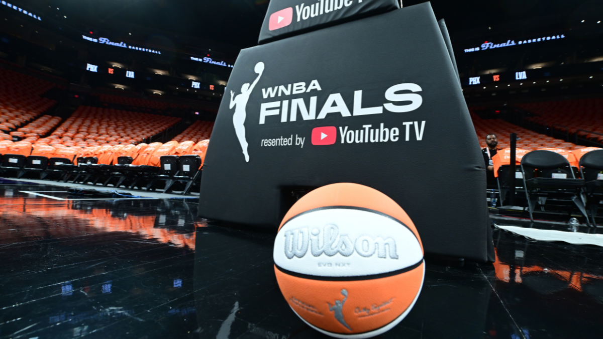
It feels good to go from nothing to something, and that’s what the WNBA is doing by upgrading the most generic, soulless Finals logo in league history to one that stands among the best. At time of unprecedented growth for the league, the reality of the situation was that this bland logo just didn’t live up to the vibrant era the WNBA has entered. The era will mostly be remembered for A’ja Wilson and the Aces unprecedented dominance, as they have won three titles in the eight years it was active.
5. 1997-2001
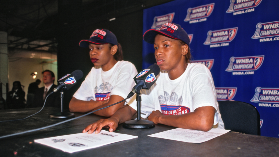
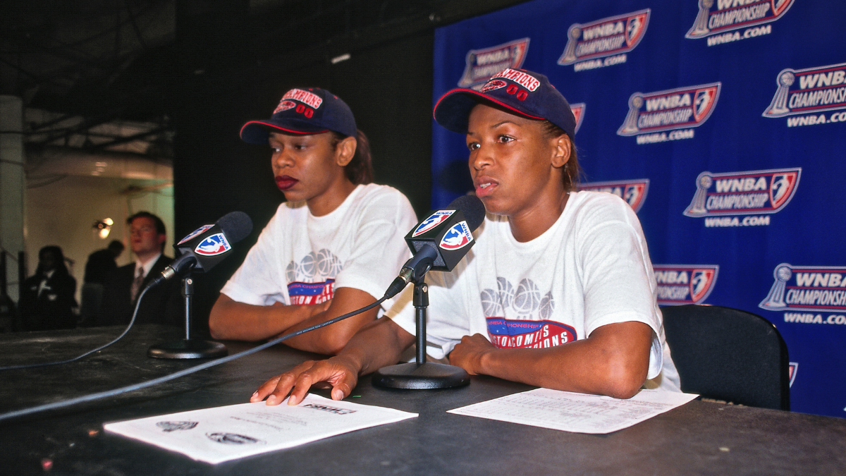
The only change between the 1997-2001 logo and the 2002 change was replacing the word Championship with Finals, coinciding with the league’s decision to rebrand the series over two decades. While it was a serviceable logo for a young league at the time, there wasn’t all that much personality and the length of “championship” causes some clunkiness. There were some positive traits about the logo, but we’ll get more into that while discussing its successor. The logo is most deeply connected to the Houston Comets, who won the first four championships in league history.
4. 2002-2006
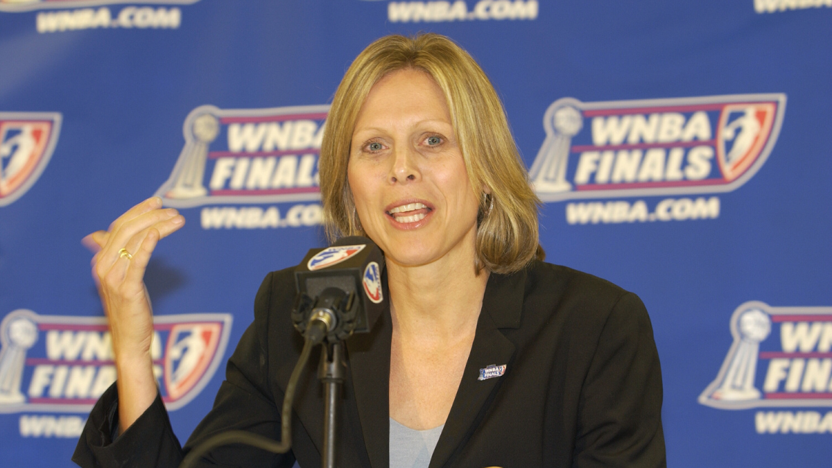
It’s impossible to rank the 2002 update too far ahead of its predecessor because of how similar they are, but the 2002 version does benefit from the word change. Finals lines up with WNBA on the line above much better, and the logo is a bit more square than the past version. It certainly isn’t a groundbreaking design, but it included the championship trophy and the league’s signature game ball which is always a plus. It was certainly an era of parity for the league, as four different teams won titles in the five seasons the logo was active.
3. 2013-2018
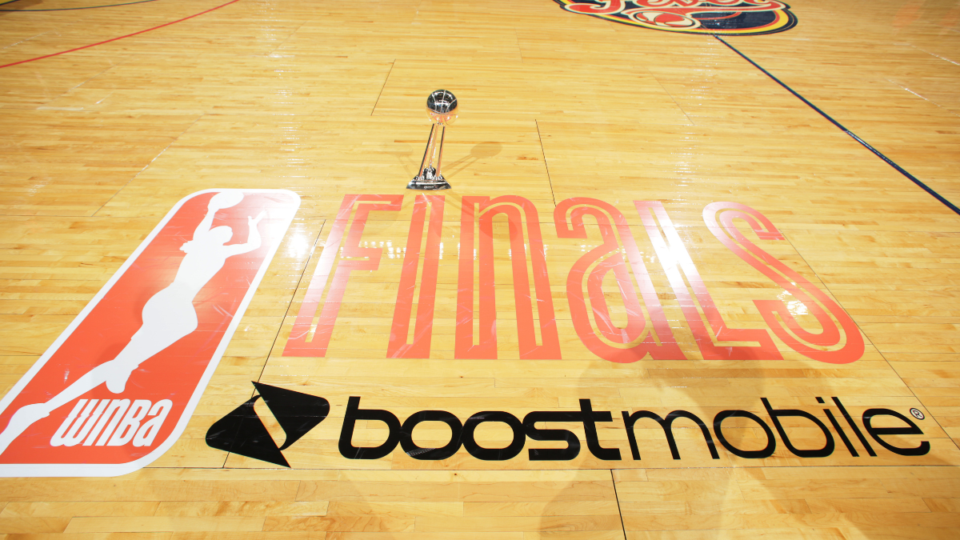
The introduction of the orange. It was certainly a pivotal change for the league, separating from the typical red, white and blue that aligned it with not just the NBA but every other American sporting league. Coinciding with the change of the overall league logo, the orange text and retro font make for a logo that has plenty of personality and one that was a definitive statement in an era where the WNBA was eager to make one. It’s not hard to think of Diana Taurasi’s Phoenix Mercury or Maya Moore’s Minnesota Lynx when you see this logo, and that was certainly a special time for the league.
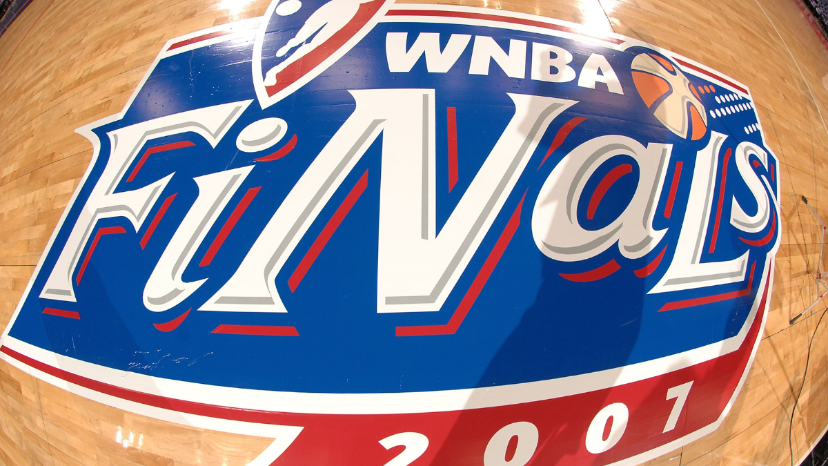
2. 2007-2012
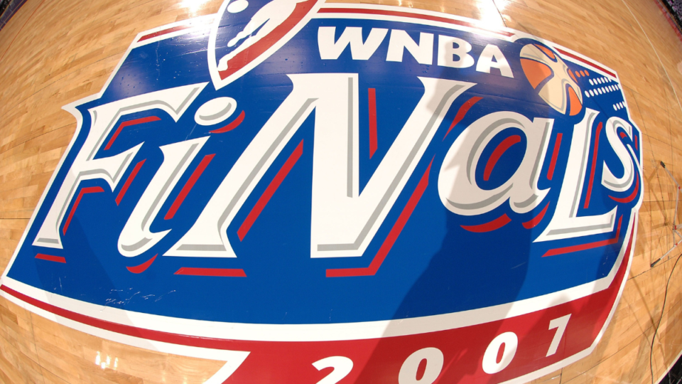
There’s no doubt about it, the 2007 logo update has more personality than any other in league history. The inclusion of the signature game ball is a necessary touch, and I actually have positive nostalgic feelings about the alternating upper and lowercase text in this version of the Finals logo. Sadly, the personality of the logo didn’t really align with where the WNBA was headed in that moment as several of the league’s founding franchises folded due to financial woes that became unmanageable during and after the 2008 Financial Crisis.
1. 2026-
A new mark for the moment that matters most
Here’s a closer look at the elements behind the new WNBA Finals logo. From our iconic Logowoman and championship trophy to custom lettering inspired by the speed and intensity of championship basketball pic.twitter.com/0xYm69HqAx
— WNBA (@WNBA) August 30, 2026

I won’t go as far as saying this is the perfect logo, but it’s a home run for a league that has more eyes on it than ever before. It has the perfect balance of personality and seriousness, plus it has a more detailed depiction of the championship trophy than we’ve seen on any of the past logos. The font and tailed S at the end of the word Finals add a classic flair to the logo that will almost certainly look great on the hardwood. It will at the very least be a major improvement from the generic nonsense we’ve dealt with the last eight years. Which players and teams will come to define this era? That’s still to be determined, but there are plenty of intriguing candidates.

The post Ranking The WNBA Finals Logos appeared first on Ballislife.com.