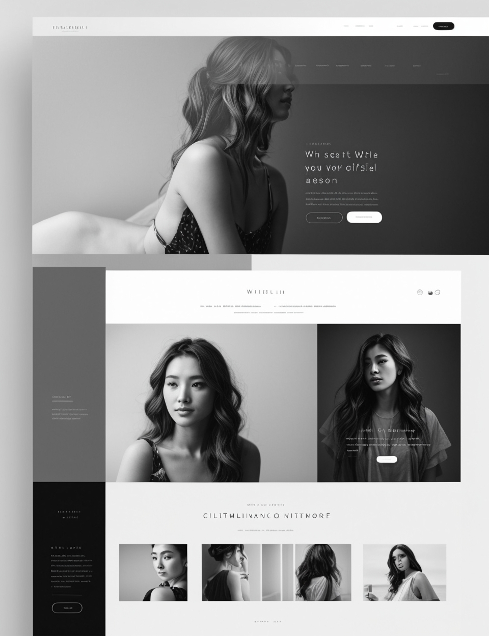
The Psychology of Web Design explains how neuromarketing works, using engaging stories from real-world businesses. You’ll learn about six different psychological principles that can be applied to your website and how each will boost your conversion rates by making visitors more likely to buy your products or services. Once you understand these principles (which we explain as simply as possible), there are specific tactics you can use to put them into practice right away!
F(r)iction
Friction is the idea that people will put off a task if they think it will be more difficult than they expect. So if you make your site too complicated, users will get frustrated and leave. On the other hand, if you give them too little information or not enough time to complete a task, friction can also result in abandonment.

To avoid this problem altogether–or at least minimize its effects–be sure to test your designs against real people in actual situations (as opposed to just using A/B tests). You should also consider whether there are any aspects of your design that could be improved upon without adding complexity; for example:
- Is there enough contrast between the text and background colors?
- Are links clearly visible on hover?
- Are there any elements that might distract visitors from completing their goals (e-commerce sites should avoid pop-up ads!)
Minimalism
Minimalism is essentially the opposite of clutter. It’s about removing visual distractions and making your website easy to navigate.

Minimalist design is not about plainness; it’s about simplicity. You want to keep things simple by removing extraneous elements, but you don’t want your site to be boring or bland either! There are many different ways you can achieve this balance:
- Use clean lines and solid colors instead of patterns or gradients (which can make things harder for people with poor vision).
- Remove unnecessary text–bullet points are better than paragraphs when possible because they let users scan quickly through information without losing track of their place in the text flow.* Use large fonts so readers can see what they’re reading easily without squinting at tiny font sizes!
Clarity and Clutter
Clarity and clutter are two sides of the same coin. Clutter makes it hard to find what you’re looking for, while clarity makes it easy. It’s not just about visual clutter, but also content clutter–the latter being the opposite of simplicity. A website that is “cluttered” has too much information on it, making it difficult for visitors to navigate and digest what they need from the site in order to make a purchase decision. This can lead visitors away from your page without converting into leads or customers at all!

A good example of this would be Amazon: if someone wants one specific product (say an iPhone), they’ll type in “iPhone” into Google or Bing–and then click on whichever link brings up first in their search results list (iPhones tend not to have great SEO). But once they arrive at Amazon’s homepage? There are so many other options available besides iPhones…so many other things that could catch someone’s eye instead…This means there’s less chance those looking specifically for iPhones will stay engaged long enough before moving onto another site entirely where there might actually be more relevant products available for them than what we currently offer here at Amazon HQ.”
Social Proof
Social proof is a phenomenon in which people are influenced by the actions of others. The more people that see the same thing, the more likely it is to be true. And while this has been used in marketing for decades (think testimonials), social media has made it even easier for businesses to leverage this powerful tool.

The psychology behind social proof is simple: other people’s opinions matter because they’re based on experience and personal knowledge–qualities we value highly when making decisions ourselves. When someone sees something enough times on their Facebook feed or Instagram feed or wherever else, they’re more likely than ever before to believe what they’re seeing and do whatever action they think everyone else is doing as well.
Credibility and Trustworthiness
If you want to boost your conversion rates, it’s important to create a website that people trust. Credibility and trustworthiness are two of the most important factors when it comes to making a decision about whether or not they should buy from you.

Let me explain how this works: When someone visits your site, they’re making an unconscious judgment about whether or not you are credible and trustworthy based on everything they see. If there are spelling mistakes on your homepage or if it looks like it was designed by a six-year-old with no experience in web design at all, this will immediately lower their opinion of your business as being reliable and honest (two qualities required for building trust). This can make them less likely to engage with the content on the page because they may feel like anything else written there will also be unreliable or dishonest.
It doesn’t matter if all of this information is accurate–the fact that these impressions exist means that many potential customers might pass over what could otherwise be valuable content for them!
Web design is the art of influencing human behavior.
The psychology of web design is the art of influencing human behavior. Web designers use psychology to influence users’ actions and emotions, with the goal of increasing conversions.

If you’re a designer, this should be music to your ears! You can use these principles in your own work to increase conversion rates.
Web design is an art, but it’s also a science. The right combination of colors, fonts, and images can make people feel certain ways and take certain actions. If you’re looking to improve your website or app, keep these principles in mind.
Leave a Reply